Oui, Michael Mann a encore ré-étalonné son film. C'est plus sombre, effectivement.

Mais, bon, comme on aura jamais mieux en UHD, je prends quand même...
Sur bluray.com, Geoff D a écrit :Heat (1995) 4K HDR10 review, UK Disney UHD disc. HDR metadata: Mastering display colour primaries: DCI-P3. Mastering display luminance levels: 1000/0.005 max/min nits. Maximum Content Light Level: N/A. Maximum Frame Average Light Level: N/A. Disc type: UHD66.
Michael Mann's ode to the professionals on both sides of the law in L.A.'s underworld remains a masterpiece some 27 years later, and it's finally hit UHD disc 5 years after Mann supervised the 4K restoration in 2017. Photographed by Dante Spinotti (also behind the camera on Last of the Mohicans and Manhunter), they opted for 35mm anamorphic using fast 500-speed stock, albeit pushed to 800 ASA to gain some more speed in the various low-light scenarios that feature throughout the film. Pushing the film (exposing it to less light during photography and then developing for longer) can increase grain but Spinotti noted to American Cinematographer (Jan. 1996) that it didn't adversely affect the film, citing the usage of anamorphic as a great leveller because of the increased amount of negative area that it covers vs spherical formats. Spinotti did tests of the L.A. skyline using the ENR silver retention process which made the image more contrasty but ultimately decided against using it because of the inherent desaturation of that process, though he used that 'look' as a guide for capturing the dark underbelly of the city. And yet it's not so much that they wanted a bright, colourful look to the movie, but as they were already working with a palette that leant towards realism rather than "pop" (ugh) then they didn't want to desaturate it further, populating the darker scenes with complementary lighting to match the yellow, green and blue-green tones that were being kicked out by existing street lamps and other sources. They even added a blue colour filter to their colour temperature meter to shift the greens slightly towards blue and to give the nighttime colour a "softer, denser" look. (Readers may recall that Mann didn't want the nighttime in Collateral to look "too fruity" either: https://forum.blu-ray.com/showpost.p...&postcount=636)
Basically this movie wasn't intended to look as colourful, bright and sharp as Marvel Movie #59, not now and not ever. It's been disappointing people in visual terms for as long as it's been on home video, them wanting one thing but Mann delivering another, as well as the original photography not capturing the kind of razor-sharp appearance that people crave. Mann has undeniably changed some things with regard to how the movie looked vs the 2009 Warners Blu-ray, but wherever was it said/confirmed that that was a 100% pure reproduction of the original theatrical colours? Mann is an arch-tinkerer but when it comes to changing something's look for home video he's not alone in a field of one, he's among many who make their films look different every single time they go up for a new transfer, adjusting it to how their current tastes are. The bonkers thing though, and appy-polly-loggies for repeating this, is that the 2009 effort still has a huge helping of teal. That's not everyone's main beef with the UHD (that be the darkness) but it's being thrown around a lot nonetheless and folks should get out their Warners BD to have a look see. The main Warners logo alone is overloaded with teal, it's the classic yellow shield against a painted blue sky but the sky ain't blue no more! It may have well have whiter whites but background tones anywhere near approaching green generally look a lot tealier on the 2009, and skin tones look so pale and dried out.
For the 2017 SDR version the white balance was adjusted to a slightly warmer tone and skin tones were warmed up quite dramatically, adding a strong orange hue to skin in many interior shots, with a reduction in teal in some spots and an increase in teal in others, though the classic shot of De Niro against the sea at night still looked good and blue. On the HDR rendition of the 4K transfer the colours have been altered again, the teal is distinctly less prominent in whatever shot vs the 2017 and the white balance is warmer still. It gives whites a distinctly 'creamy' hue where even the lettering in the title sequence is much whiter in the 2017 than in the UHD. The biggest difference is the skin tones though, if they're too washed out in the 2009 then they're far too overcooked in the 2017. Several of the night interiors have had this orange tint dialled in and it makes people look like oompa-loompas, I've used that descriptor before but it holds true regardless and it makes the 2017 look more unbalanced, more gaudy when set against the teal background. What the UHD does is compromise between the 2009 and 2017, reining in the excessive orange cast but retaining a lot more warmth than what the 2009 does so people still have a pleasant golden sheen to them. Exteriors and day interiors are usually far cooler for skin tones and that remains true of all three versions.
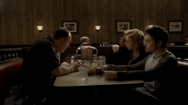
One of the bigger changes between the 2009 and 2017 was in the black levels, the former retaining very heavy blacks which made some scenes look rather comical such was the contrast between light and darkness. I actually mentioned this years ago after watching the 2017 but check the scene around the hour mark when Vincent goes back to the restaurant after being called out to the murder of the young hooker. The shot of Diane Venora wearing a dark suit in a dark location with a dark background out the window behind her looks ridiculous on the 2009, it's not quite just her face floating in the darkness but it's not far off either, and with the pale skin tones of that older transfer she almost looks like a ghost. The 2017 lowers the gamma considerably and brightens the low end, it doesn't necessarily reveal scads more lowlight information (that's what you get when shooting something like that underexposed, you can't 'see' right into the toe of the negative) although there's a little more definition on her suit, but it loses that 'floating face' effect of the 2009 and again just feels more balanced between light and dark. The 2017 does still overdo the skin tones though which makes it look funny for a different reason, having this blazing orange face staring back at you. The UHD ties all of this together, keeping much the same overall level to the shadow detail as the 2017 but timing it darker overall and losing that extreme oranginess without sacrificing warmth. I thought that scene was mesmerising on the UHD, it's almost like the visual equivalent of what Mann (and then Nolan) does with the audio mix: the thing you should be concentrating on is buried so low that you have to concentrate twice as hard to make it out.
So yeah: the UHD is palpably darker than the 2017 (and that's SDR viewed at 140 nits peak, never mind what wild and crazy numbers everyone else is watching SDR at) and you feel it the most in several of those restaurant scenes. As someone said, the darker look on the UHD helps to offset the 'thin' look to the blacks on the 2017. Oddly enough it makes them feel more intimate on UHD but it is not going to be to everyone's taste, and certainly not to most youtube or amazon reviewers. The rest of the movie though? Daylight exteriors don't blaze with bright sunshine on the UHD but don't look impenetrably dim to me - watching in a darkened room as I ALWAYS do for HDR, no exceptions - and some brighter interiors have a decent enough light level for what is essentially SDR in an HDR container. Or perhaps this is a theatrical HDR grade (Dolby Cinema aims for 108 nits) that's been ported bit for bit into home HDR space? That would explain the low average brightness level and yet the 2009 isn't as bright as the 2017 either, the UHD is still dimmer than both but the 2009 isn't as gung-ho as the 2017. In terms of highlights it's a wash, no extra information on the UHD.
Detail-wise the UHD is excellent. Not in a majorly aggressive Sony-sharp kinda way but it reveals a sterner edge to the photography than might be apparent otherwise. The anamorphic glass they were using was old even for the time and didn't retain masses of sharpness, especially in those darker scenes where underexposing it is going to further hamper your level of acuity, yet the 4K UHD has some noticeable refinement to the smallest high-frequency details in all the usual places: hair, clothing, stubble on faces etc. And as soon as I saw the wide overhead shot of the cars at the abandoned drive-in I thought 'there's gotta be some 4K detail there' and so it proved, the UHD does a betterer job than either the 2017 or 2009 discs. I've just noticed that capsaholic have that same shot up too, so while I don't look so special for pointing it out it's one of the best examples of the UHD's increase in detail. That applies to the grain as well, again this ain't no Sony joint with grainz-a-poppin' but there's a constant layer of it throughout, more prominent than on either of the two 1080p Blu-rays yet still quite gentle and refined. I'm surprised that the 500-speed stock looks this refined but the lack of ultra-brightness in the HDR helps in that regard as it's not setting off the grain. There are a couple of opticals which soften up, like the shot of the guard getting executed with a shot to the head where they've added in the muzzle flash (as no way could you fire a blank at that close range), and a few other shots get a bit gritty, but other than those there's not much crud lurking in the source material. There are a few digitally composited scenes as well, I didn't even realise that the stuff with Edie and Neil having their heart-to-heart on the terrace overlooking the city was shot against green screen!
On the compression side of things Disnee have proved their mastery of the dark arts, managing to squeeze this 170-minute movie plus several audio tracks onto a UHD66 with no visible drawbacks. I thought it might come unstuck as it's not a clean, digital compression-friendly source like that on Avengers: Endgame (another lengthy flick crammed onto a UHD66) and yet both movies have a lot in common in terms of their content, that there's way more talk than action across those ~3hr running times and so the bitrate can be properly managed and allocated to where it needs to go. As such Endgame has zero compression problems and neither does Heat. At very close scrutiny the grain field doesn't always look pin-sharp but there was never a moment where I thought 'oof, this looks a bit dodgy' in motion (unlike most StudioCanal joints, say) and there's no chroma noise gunking things up, nor is there banding in all those near-black gradients either. I literally sold the 2017 Blu-ray after a day because the compression is so bad on it, there's this bizarre thing where out of focus elements in backgrounds are all blocky and weird, it's subtle but it's there and it pissed me off. So I'm very pleased with the far superior encoding of the UHD, all things considered. Disnee's authoring house may yet come undone but, like The Undertaker's famous run at WrestleMania, their streak continues.
If I had to sum up the UHD in one word it would be this: richness. Not in the broader sense of the word where there's endlessly rich colour and contrast but the UHD makes me feel like I'm watching a DCP. It's still SDR masquerading as HDR, no question, but it feels sturdier than the 2017 disc in several respects. In my review of Collateral I said that despite its minimal improvements, if any, the UHD felt like a more 'grown up' version of the movie, less concerned with spectacle than it is with telling the story, and I feel much the same way about the UHD of Heat. I won't claim to know what this movie looked like as I didn't even see it in the cinema, but here and now this is my favourite rendition of it. It's denser, warmer and markedly less tealy than prior versions and it doesn't have the silly perma-tanned glow to skin tones that the 2017 has. Is it dark at times? You bet. Did I ever feel it was so dark it was hampering my enjoyment of the film? Absolutely not, though other people's technological and/or viewing circumstances may hinder their impression of it. Add the benefits of the 4K resolution plus the solid compression (it's mad that a company that doesn't give a shit about UHD disc has one of the best authoring houses in the business) and this one's a keeper.
Sur bluray.com, Geoff D a écrit :It IS darker, of that there's no doubt. Most people who dig it have fully acknowledged this. The difference is in the perception of that darkness, from a perspective of taste and/or how viewing conditions affect that darkness. I'm setting myself up for a fall here but it's interesting how many people who've insisted that it's too dark, that it's broken, that it's trash etc have never stated whether they're viewing in a darkened room. Perhaps it goes without saying, or perhaps they're always watching with the curtains open and the lights on. If so, then this UHD will be destroyed by such viewing conditions.